
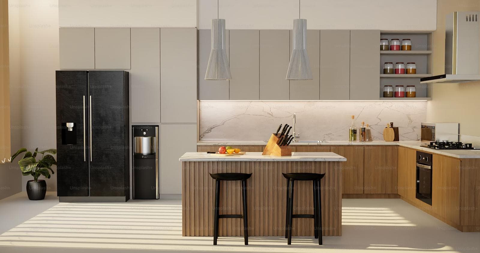
The all-white kitchen had a long reign. For the better part of a decade, a single neutral tone applied uniformly across every cabinet was the default choice for homeowners who wanted a kitchen that felt current, clean, and reliably saleable. That era has not ended — white and neutral palettes remain practical and popular — but the design conversation has moved significantly. Two-tone and multi-tone kitchen cabinetry is now the defining approach of bespoke kitchen design in the UK, and the 2026 version of it is more considered and more sophisticated than the high-contrast trends that preceded it.
The shift, as Naked Kitchens’ Jayne Everett describes it, is from bold expression to composed confidence — kitchens that use colour layering to add depth and personality rather than to make a statement. This guide explains the design principles behind that approach, the five placement strategies for distributing colour across your cabinetry, and the colour pairings that are working in bespoke kitchens right now.
Why Two-Tone Cabinetry Works — and When It Doesn’t
Two-tone cabinetry is not a trend in the superficial sense — a style that arrives, dominates briefly, and becomes dated. It is a design strategy that responds to specific spatial and compositional problems that a single-tone kitchen cannot solve.
What colour layering achieves that a single tone cannot:
- Visual weight distribution. A kitchen with base units in a darker tone and wall units in a lighter one places visual weight at the base — where it belongs physically — and keeps the upper half of the room open and A kitchen painted uniformly dark can feel oppressive regardless of size. The same dark tone on base units only rarely does.
- Zone definition without walls. In open-plan kitchen-diners — the dominant layout in UK new builds and extensions — two-tone cabinetry can visually demarcate cooking from dining or socialising without any structural An island in a contrasting tone, or a darker utility-end run against a lighter main kitchen, achieves this effectively.
- Depth and dimension. A flat wall of uniform cabinetry reads as a surface. The same wall in two complementary tones reads as composed, layered The difference is not about colour drama — two very similar tones achieve this as effectively as high contrast.
- The scale correction. A large kitchen in a single mid-tone can feel flat. The same kitchen with a contrasting island or feature zone gains a focal point that makes the scale feel intentional rather than
When two-tone cabinetry doesn’t work:
Colour layering fails when the relationship between the tones is unconsidered. Two colours that are close in tone but different in undertone — a warm white and a cool white, for example — read as an accident rather than a choice. The viewer cannot tell whether the difference was intentional. The same applies to random placement: a darker colour applied to one run of base units for no compositional reason looks like a mistake, not a design.
The principle that prevents this is simple: every second colour in a kitchen should occupy a space with a clear boundary — a zone, a unit type, a feature element — and the relationship between the tones should be legible. Either they contrast clearly or they relate obviously. Ambiguity is the only failure mode.
The 60-30-10 Rule: A Practical Framework for Colour Distribution
Interior designers use the 60-30-10 rule as a reliable framework for distributing colour across a room. In a kitchen context:
- 60% dominant colour — the primary cabinetry This is typically the wall units, the main perimeter run, or whichever element represents the largest single area of cabinetry. In most kitchens this is a neutral: white, linen, warm stone, or a mid-tone like greige.
- 30% secondary colour — the base units, island, or a specific zone. This is where the character of the kitchen It should relate clearly to the dominant tone: contrasting deliberately, or toning closely within the same colour family.
- 10% accent — hardware, open shelving, a feature tile, a painted ceiling, or the kitchen’s exposed structural elements. This is the colour that ties the palette together rather than introducing a new
The value of this framework is not that it produces identical results — it is that it prevents the single most common mistake in multi-tone kitchens: over-applying the second colour. A second tone that occupies 50% of the cabinetry is not a two-tone kitchen. It is two separate kitchens joined at the hip. The 30% allocation keeps the secondary tone as an intentional feature rather than a competing field.
2026 Direction: Subtle Over Dramatic
“In 2026, the most refined two-tone kitchens use two shades of the same colour family — a soft sage upper with a deeper, richer green lower, for example. The effect is layered and nuanced rather than contrasted and loud. It makes a room look effortlessly sophisticated.”
Five Placement Strategies: Where to Put Each Tone
The single most important decision in a two-tone kitchen is not which colours to use. It is where to place each one. The five strategies below cover the range from the most conventional to the most distinctly bespoke.
| Strategy | Where Each Tone Goes | Effect and When to Use It |
| Upper / Lower Split (most common) | Lighter tone on wall units; darker or bolder tone on base units | Grounds the room visually — weight sits where it should. Light uppers keep the upper half of the room open and airy. Most versatile approach for any kitchen size. Works with high contrast (white/navy) and subtle contrast (linen/mushroom). |
| Island as Accent Zone | Perimeter cabinetry in one tone; island in a contrasting colour or natural material | The island becomes the focal point of the kitchen. High-contrast islands (a dark island in a light kitchen, or a natural oak island in a painted kitchen) draw the eye and anchor the space. Best for kitchens with a clearly defined island. |
| Pantry / Larder as Second Colour | Main cabinetry in primary tone; pantry or utility run in contrasting colour | Restricts the bolder colour to one zone, giving it maximum impact without dominating. Gives the pantry a distinct identity within the kitchen. Excellent for open-plan kitchens where the utility end needs to read differently. |
| Tone-on-Tone (same family, two depths) | Two shades of the same colour — eg. soft sage uppers / deeper
sage-green lowers, or warm linen uppers / mushroom-taupe lowers |
The most sophisticated and hardest to execute well. Produces a refined, layered effect without any jarring contrast. 2026’s dominant direction per Naked Kitchens and kitchen.magic — ‘composed confidence’ rather than high drama. Suits period and contemporary kitchens equally. |
| Pinstripe / Profile Detailing | Main cabinetry in one tone; second colour applied only to the moulding or profile of each door | The most unusual and most bespoke approach. Colour traces the door profile rather than filling the whole face. Emphasises craftsmanship. Works only with genuinely bespoke joinery where the profile is part of the design. Introduced at scale by 202 Design for a Livingetc feature, July 2026. |
2026 Colour Pairings: What Is Working in Bespoke Kitchens Right Now
The palette shift of 2026 is clearly away from cool grey and clean white toward warm neutrals: mushroom-taupe, soft greige, sandy stone, and creamy linen as the dominant tone, with natural wood, warm green, or depth-adding accent tones as the secondary. Hardware has moved decisively toward brushed brass, bronze, and unlacquered metals.
| Dominant Tone (60%) | Secondary Tone (30%) | Accent (10%) | 2026 Character |
| Warm linen / off-white | Mushroom-taupe / warm greige base units | Brushed brass or bronze hardware | The 2026 benchmark. Organic, warm, layered. Suits both Shaker and contemporary profiles. |
| Soft white / stone | Deep sage-green island or larder | Unlacquered brass or matte black | Classic contrast. Timeless rather than fashionable. Works in any kitchen size. |
| Dominant Tone (60%) | Secondary Tone (30%) | Accent (10%) | 2026 Character |
| Pale sage / soft green | Deeper sage or forest green lowers | Natural oak open shelving | Tone-on-tone green. The purest expression of 2026’s l ayered-not-contraste d direction. |
| Deep navy blue | Crisp white or warm stone uppers | Polished nickel or chrome | A reliable classic. Navy-and-white never fully goes out. Add warmth with stone rather than pure white. |
| Charcoal / dark slate | Natural white oak or walnut base / island | Matte black or aged brass | The material-mix approach. Painted cabinetry with natural wood tone. Rich, contemporary, and warm. |
| Cream / Colonial cream | Warm terracotta or clay feature zone | Copper or antique brass | Earthy warmth.
Strongest in south-facing kitchens with good natural light. |
| Natural oak (unpainted) | Painted perimeter in soft white or linen | Matte black handles | Wood-as-second-ton
e. Growing strongly in 2026. Warmth from wood; clarity from paint. |
Colour combinations are indicative. Natural light, room orientation, and existing fixed elements (flooring, walls, architecture) all affect how a palette reads in practice. An in-home design consultation is the most reliable way to confirm a combination before committing.
Beyond Paint: Mixing Texture and Material as a Second Tone
The most interesting development in multi-tone kitchen design in 2026 is the growing use of natural material — primarily oak and walnut — as the second tone rather than a second paint colour. Rather than asking ‘which two colours?’ the question becomes ‘which colour and which material?’
A painted perimeter in a warm neutral with a natural oak island creates warmth and textural interest that two painted tones alone cannot achieve. The wood grain provides a relief from the painted flatness; the painted cabinetry provides a foil that makes the wood grain more visible and appreciated. Grace House Studio’s 2026 trend analysis identifies white oak lowers with painted uppers, or painted perimeter with natural wood island, as producing ‘a warmth and layering that two painted tones alone can’t always achieve.’
Texture mixing extends to finish as well as material. A matt lacquer base unit paired with an open oak shelf above, or a gloss-painted island against matt painted cabinetry, adds a dimension of contrast that does not require any colour change at all. In bespoke kitchen design, where the specification is entirely within the client’s control, this kind of finish-level differentiation is often the mark of a genuinely considered kitchen rather than one that has followed a trend.
Two-Tone in Period and Traditional Kitchens: A Different Conversation
In Victorian, Edwardian, and Georgian properties — HM Elite Interiors’ most common kitchen context — two-tone cabinetry has a longer history than the current trend cycle suggests. Traditional English kitchen design frequently featured a contrast between painted cabinetry and natural timber elements: pine dressers, oak worktops, painted Shaker doors against exposed brick or stone.
The contemporary expression of this in a period property kitchen often benefits from restraint. High contrast (navy and white, charcoal and cream) works in a Georgian-proportioned kitchen where the ceiling height and room size can absorb the drama. In a tighter Victorian scullery-to-kitchen conversion, tone-on-tone or a subtle natural wood accent is typically more successful. The test is always whether the colour layering feels indigenous to the house or imported from a different architectural context.
Profile and door style matter as much as colour in period kitchens. A deep Shaker rail-and-stile door in mushroom-taupe with a complementary sage green island reads as considered and period-appropriate. The same combination on a handleless slab door may feel less settled in a Victorian terrace, however contemporary the palette.
“We were nervous about going two-tone — we’d seen it done badly and didn’t want our kitchen to look like two different kitchens stuck together. HM Elite recommended a tone-on-tone approach: warm linen on the wall units and a slightly deeper mushroom-taupe on the base units. The result is subtle but exactly right. People notice there’s something interesting about the kitchen without being able to immediately say what it is. That’s exactly what we wanted.”
Mark and Julia S., Surrey
Talk to HM Elite Interiors About Your Kitchen Palette
Colour decisions in a bespoke kitchen are made in the context of the specific room — its orientation, its natural light, its fixed elements, and the character of the property. HM Elite Interiors works with clients through this process at the design stage, presenting material samples and colour relationships in the actual space rather than from a catalogue.
Every HM Elite kitchen includes a full colour and material specification discussion as part of the free design visit. No charge, no obligation.
Book Your Free Design Visit
“Visit hmeliteinteriors.co.uk or call us to book your free kitchen design visit. We cover [HM Elite’s service area — update before publishing]. We bring material samples to your home as part of the visit.”
Frequently Asked Questions
Are two-tone kitchens going out of style?
No. Two-tone kitchen cabinetry is a design strategy, not a trend, and it responds to compositional problems
— visual weight, zone definition, depth — that a single-colour kitchen cannot solve. What changes is the specific expression: 2026 has moved significantly away from high-contrast combinations toward tone-on-tone and material-mixing approaches that feel composed and considered rather than dramatic. That direction is likely to persist — restraint ages better than boldness in kitchen design.
What is the most popular two-tone kitchen combination in 2026?
Warm neutral upper cabinetry (linen, off-white, warm stone, or soft greige) paired with a slightly deeper or richer lower tone in the same warm family (mushroom-taupe, warm greige, sandy stone) is the dominant combination in UK bespoke kitchen design for 2026, per Naked Kitchens and kitchen.magic. Hardware is predominantly brushed brass or bronze. The island or larder, if present, often takes the second colour as a feature accent. Navy-and-white and sage-and-cream remain timeless second choices.
How do I stop a two-tone kitchen looking like a mistake?
Three rules prevent a two-tone kitchen from reading as accidental: each colour should occupy a clearly bounded zone (base units, island, wall units, pantry — not a random selection of cabinets); the relationship between the tones should be legible (either clear contrast or clear tonal relationship — not ambiguous near-matches); and the 60-30-10 distribution should be respected (dominant tone at 60%, secondary at 30%, accent at 10%). The most common mistake is applying the second colour to too much of the cabinetry, creating a room that reads as two kitchens rather than one considered design.
Can I have more than two colours in a kitchen?
Yes, but with increasing caution as the number of tones rises. Three tones work well when one is a natural material (wood, stone) rather than a third painted colour — the material provides contrast without adding chromatic complexity. Four painted tones in a kitchen almost always look busy and unresolved. The most successful multi-tone kitchens build complexity through texture, finish, and material rather than through additional paint colours.
Does a two-tone kitchen add value to a property?
A well-executed two-tone kitchen in a considered palette adds value consistently, particularly at the mid-to-upper end of the market where buyers expect evidence of design decision-making rather than a simple neutral specification. An unconsidered two-tone kitchen — mismatched tones, poor distribution, or combinations that have become dated — can neutralise or reduce the value added by an otherwise well-specified kitchen. The quality of execution and the timelessness of the palette matter more than the number of colours.